ShopDreamUp AI ArtDreamUp


Suggested Deviants


Suggested Collections


You Might Like…


Description
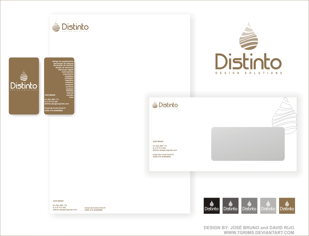
This is one of the corporate images I’m suggesting for my ex-co-worker, he is opening a design company, and hopefully I may possibly be one of the future associates of his company.
The translation of the company name: Distinct
The translation of the company name: Distinct
Image size
1000x762px 131.32 KB
© 2006 - 2024 7grims
Comments44
Join the community to add your comment. Already a deviant? Log In
I agree with all ElenaSham comments about spacing from the edges, gradient and "design solutions" being wider than the name (also it's not aligned on the left). Now I have a few of my own...
Why the water drop? What's it saying about the company? Why brown? For a company that is named distinct the design is rather bland. (Not to sound too harsh). The design could really use more personality including the type. Think about your layouts and how the pieces interact.
Envelope: The logo is too small and the contact info is placed oddly. All you need is the address not the phone, email, or name. Enlarge and fade watermark...it looks like a mistake
Business card: The front is ok I personally think you landscape it. As for the back what is all that copy? It's not necessary. Here you should have name, title, email, address, phone and website. In that order (you can leave out one or more of those).
Letterhead: Again think about the layout. The logo is too small, lose the name, try and bring the contact info and the logo near each other. Maybe some sort of containing device or something.
Just some suggestions.